Grow NYC - A Re-Design
Grow NYC is a website where New Yorkers can connect within their community for volunteer opportunities, find local farmers markets throughout the city, educational programs, and composting site among other things.
As a New York City local, I personally feel the challenges of trying to live a greener, healthier life in this city. I want to understand other locals’ thoughts in regards to living more environmentally friendly in NYC. How they go/or how they believe they can go about living “greener” day-to-day life.
01 OVERVIEW
-
PROBLEM
GrowNYC.org was originally designed to educate New Yorkers how to live a greener & healthier lifestyle and to provide helpful resources. During my observations, I found the website design to be outdated with an inefficient layout concerning local programs and locations that the website isn't meeting my expectation that is causing disinterest and frustration.
-
OBJECTIVE
Analyze and annotate the current design to identify pain points and better opportunities for enhancing the user experience.
-
SOLUTION
The majority of users remarked on how the new theme felt more appropriate for this type of website. Navigating was simpler and overall a pleasure.
02 INFO
-
TEAM
TEAM OF 4 PEOPLE
-
TOOLS
FIGMA, FIGJAM, GOOGLE SURVEY, MIRO, ZOOM
-
TIMELINE
TWO WEEKS
-
MY ROLE
User Experience Designer, User Interface Designer, Interaction Designer, Researcher
03 COMPETITOR ANALYSIS
To ignite the design creativity and evaluate the user experience, I immersed myself in a thorough examination of our competitors, closely examining their visual appeal and usability. This in-depth analysis provided invaluable insights for the re-design.
-
They offer a modern interface that is visually striking, with a simple navigation bar. However, resources on being environmentally friendly and options for shopping locally are notably absent.
-
Their interface is dated, with simple navigation. Although there are resources on being environmentally friendly and the benefits of shopping locally, the site feels overly text-heavy and fails to keep users visually engaged.
-
Aesthetic’s for this website, checks all the boxes, offering a modern interface, simple navigation, and comprehensive information on environmental friendliness and the importance of moving away from fossil fuels. One more way to be greener in New York.
04 USABILITY
There are a lot of redundancies within the main header. The highlighting colors make the text hard to read.
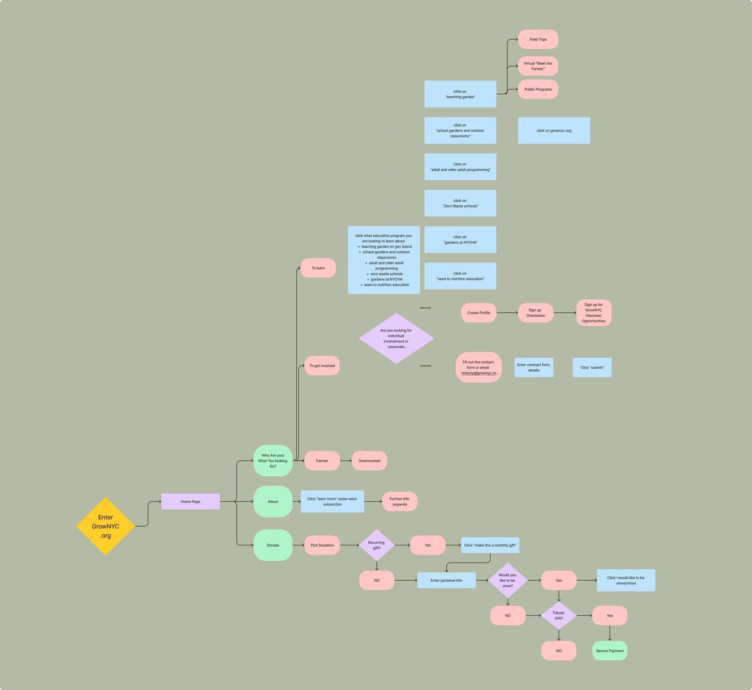
GrowNYC struggled to maintain patrons’ attention, as many users were unable to complete their intended tasks due to excessive clicks, leading to frustration and site abandonment.
05 USER RESEARCH
Who are we designing for?
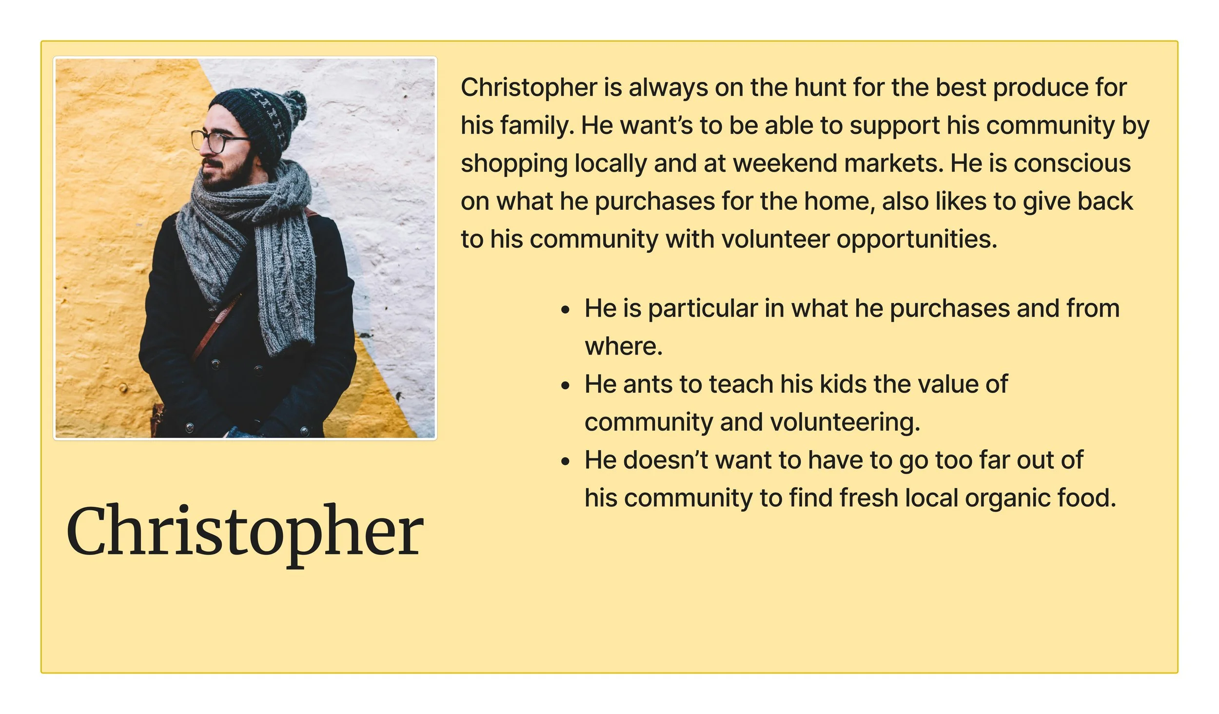
We originally designed for one persona, families. trying to teach their children about keeping our city clean, buying locally, reducing our carbon footprint. Helping the community we live it. But upon further inspection, our user research made it clear to us that it’s not just familes but a lot of young adults. Singles living on their own, both with similar goals and pain points.
Creating persons helped bring me clarity on how we would redesign Grows website. What they wanted, what they needed, and what they don’t.
06 INFORMATION ARCHITECTURE
Card Sorting
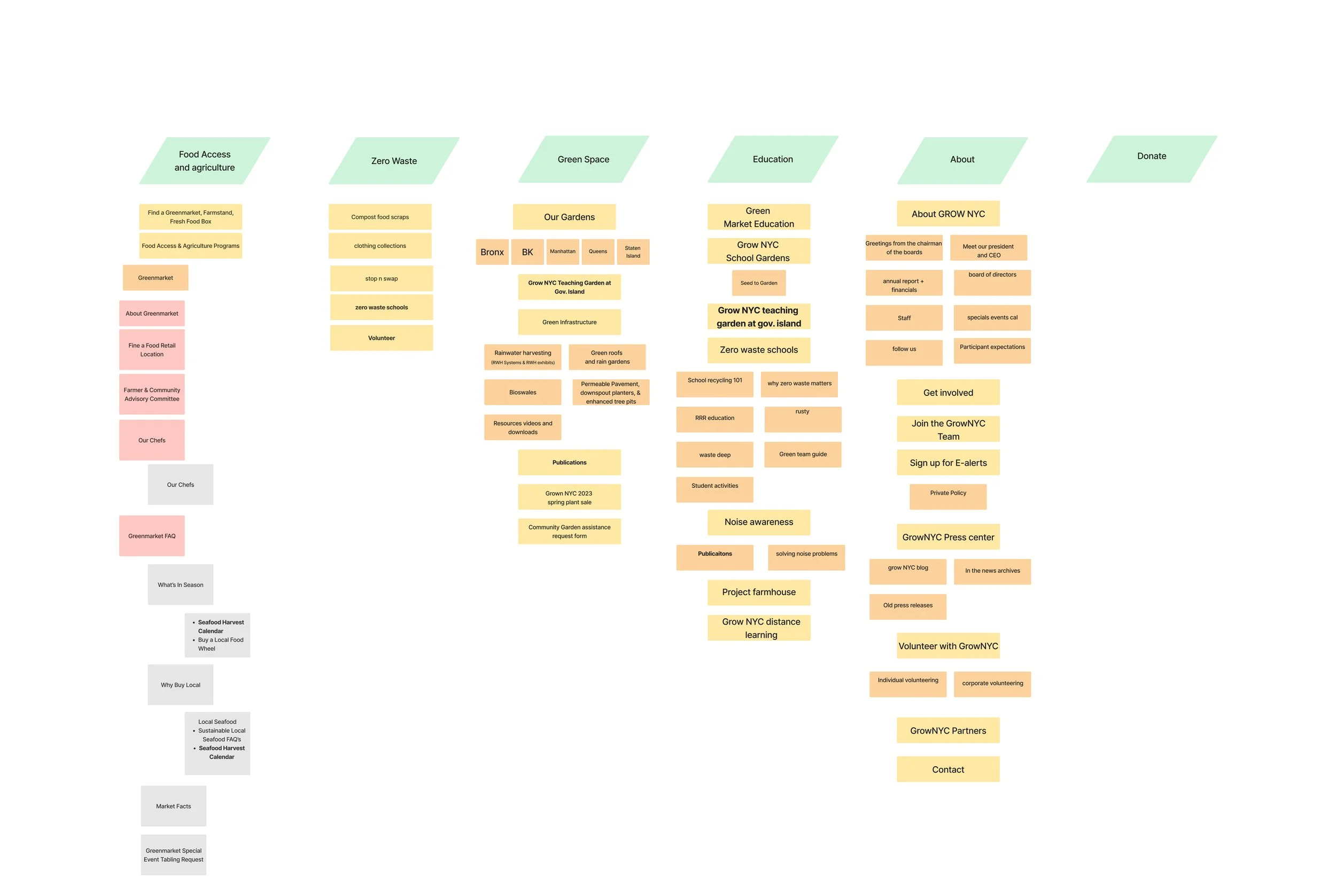
Looking over GrowNYC’s website, I was immediately frustrated at the amount of information one needed to go through to find anything with their main navigation. The constant repeat in each drop down and on the home page.
During our interviews and testing, our feedback was overwhelmingly we were able to form categories to help understand what is important for the users. Definition, fun theme, and succinct.
Drawing on interviews and team feedback, card-sorting, and competitor analyses, I organized the main content in a structure that was more logical and accessible between the main categories and subcategories. Made it easier to understand what you were clicking on, and
07 USER FLOW
08 WIREFRAMES
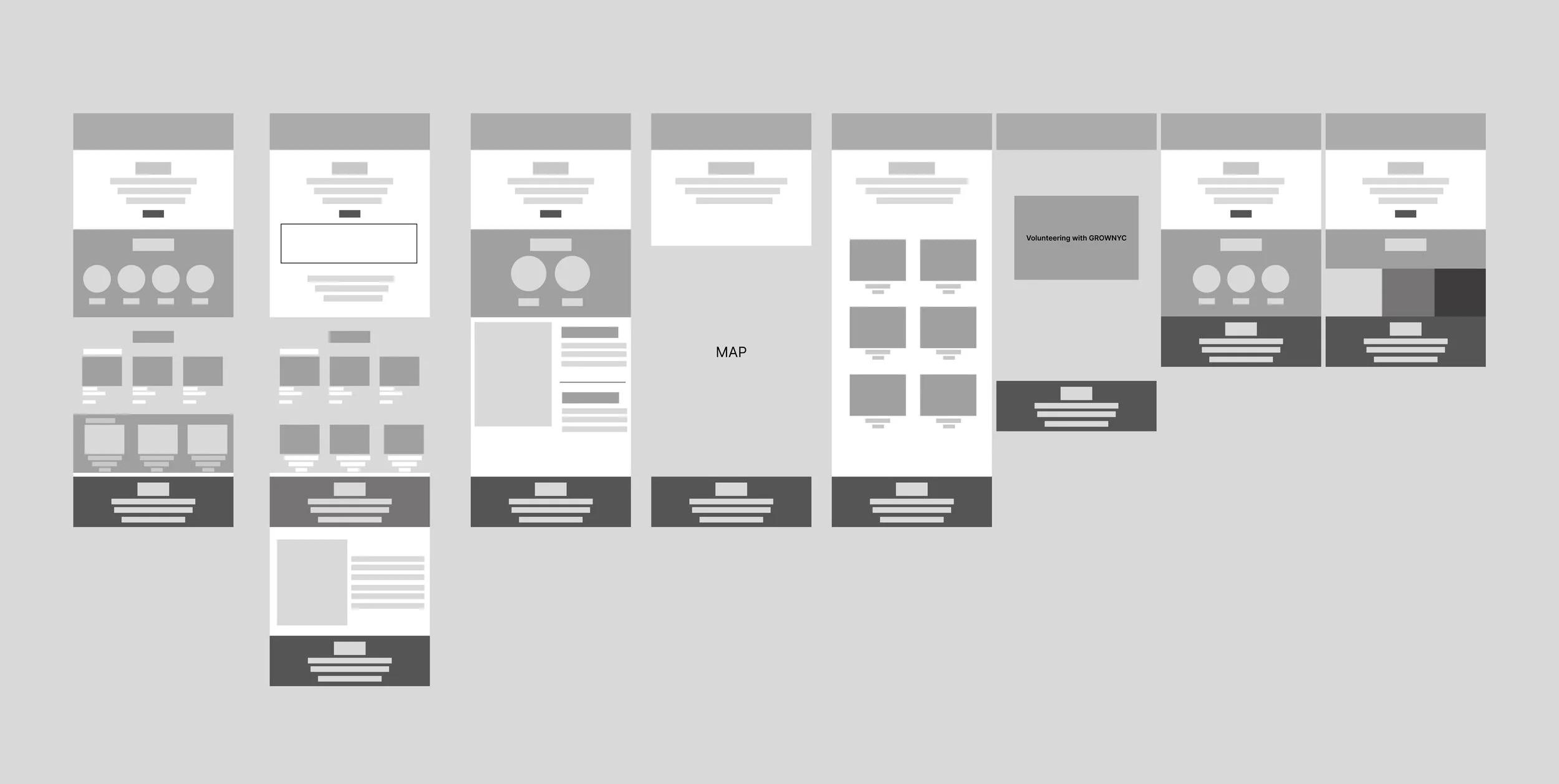
After many meetings and iterations later, we are finally able to have a clear and usable low fidelity wire frame to help guide us for our final high fidelity design.
09 STYLE SHEET
Pen to paper or to tablet, drawing out quick- low detail, but informative sketches is a huge staple in my process. Showing what prototypes can be, is crucial and helps me to communicate my ideas to clients.
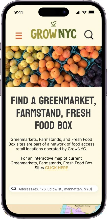
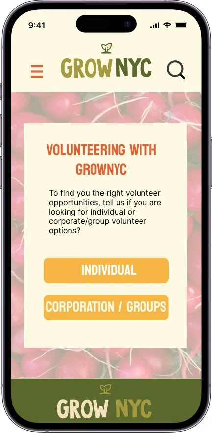
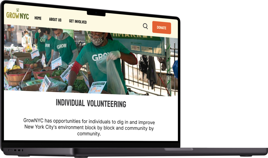
I knew when redesigning this website that the vision needed to be earthly feeling, visually striking, I wanted this to feel playful and engaging.
11 FINAL THOUGHTS
Given additional time for research and development, I would aim to present a range of options to stakeholders, including increased user testing to help improve the efficiency of the website. I believe these improvements will make this website more approachable and accessible to everyone.


